Does SOL bounce when RSI(14) falls below 30? 367 signals tested
We counted 367 hourly RSI(14) drops below 30 on SOLUSDT since Jun 2021. One day later, 50.7% closed higher against a 49.6% baseline, and the median move was +0.06%.
- Market
- SOLUSDT perpetual futures
- Timeframe
- 1H
- Data
- Jun 2021 – Sep 2026
- Sample
- 367 events
"Oversold" is one of the first words a new trader learns, and RSI below 30 is usually the example that comes with it. The story is simple: selling has been one-sided for a while, sellers run out of fuel, price snaps back. On a fast market like SOL, the hourly chart produces these readings often enough to build a whole routine around them.
The question we wanted to answer is narrow and testable: when RSI(14) crosses below 30 on the SOL 1-hour chart, does price tend to be higher a few hours or a few days later, and is that tendency any better than picking a random bar? That is the difference between an edge and a comfortable habit.
What RSI measures
The Relative Strength Index, designed by J. Welles Wilder, compares the size of recent up moves with the size of recent down moves and squeezes the comparison into a number between 0 and 100. In words: for each bar you record how much price gained or lost versus the previous close, then keep a smoothed average of the gains and a smoothed average of the losses. RSI is the share of the total movement that came from gains. If every bar in the window closed higher, the reading pushes toward 100. If every bar closed lower, it sinks toward 0. A market that rises and falls in similar amounts sits near the middle.
The standard lookback is 14 bars with Wilder's smoothing, which is what TradingView plots by default and what we used. The traditional reading is that above 70 is overbought and below 30 is oversold. It helps to be precise about what that means: RSI is a momentum statistic, not a valuation. A reading below 30 says the recent stretch of bars was dominated by losses. It does not say the losses are finished. In a strong downtrend RSI can stay pinned low for a long time, which is why "oversold" and "about to bounce" are not synonyms. Traders also use the 50 line as a rough trend filter and watch divergences, but this test deliberately isolates the simplest version, the threshold cross.
The test
We used Binance USDⓈ-M perpetual SOLUSDT candles on the 1H timeframe, from Jun 2021 to Sep 2026, which is 46733 bars. All times are UTC.
The rule: RSI(14) closes below 30 after closing at or above 30 on the previous bar, using Wilder smoothing as on TradingView. That captures the moment the market first becomes oversold rather than every bar it stays there. After an event we ignore new events for 24 bars, so one long grinding selloff does not flood the sample with near-duplicates. That left 367 events.
Outcomes are measured from the close of the signal bar to the close a fixed number of bars later: 4 hours, 1 day and 3 days, with 1 day as the main horizon. For each horizon we counted the share of events that closed higher, the median move, the middle half of the distribution and the extremes. We also tracked the deepest dip and the highest rise reached inside the 1-day window, because the path matters as much as the endpoint. The baseline is "any bar": the same statistics computed from every bar in the sample, whatever RSI was doing. These figures were calculated on historical prices; they are not actual trades. No fees or slippage are included, and on an hourly perpetual market those costs are not trivial.
Results
What happened after the signal (RSI(14) crosses below 30)
| After | Events | Closed higher | Median move | Middle half (25th / 75th pct) | Worst | Baseline: closed higher | Baseline: median |
|---|---|---|---|---|---|---|---|
| 4 hours | 367 | 53.1% | +0.10% | -1.0% / +1.2% | -14.6% | 49.8% | +0.00% |
| 1 day | 367 | 50.7% | +0.06% | -2.9% / +3.0% | -50.0% | 49.6% | -0.04% |
| 3 days | 366 | 51.9% | +0.34% | -5.0% / +5.0% | -70.4% | 49.7% | -0.05% |
Calculated on historical prices; not actual trades. Fees and slippage not included.
The honest summary is that the bounce exists and it is small.
At 4 hours, 53.1% of the 367 events closed higher against a baseline of 49.8%, with a median of +0.10% versus a baseline median of +0.00%. That is the clearest tilt in the table, and it is still a modest improvement on a coin flip rather than a reliable rebound.
At the 1-day horizon the tilt nearly disappears: 50.7% closed higher against 49.6% at baseline, median +0.06% versus -0.04%. At 3 days, 51.9% of 366 events closed higher with a median of +0.34%, the largest median here, while the mean is -0.12% and the worst single outcome is -70.4%. The gap between a positive median and a negative mean is the lesson: most signals resolve slightly upward, and a minority resolve very badly.
The path inside the main horizon tells the same story. The median worst dip within one day after a signal was -3.31%, the median best rise was +2.88%, and 34.1% of events dipped more than 5% at some point. Even signals that ended higher often spent time meaningfully underwater first.
By year (move after 1 day)
| Year | Events | Closed higher | Median move |
|---|---|---|---|
| 2021 | 30 | 56.7% | +1.80% |
| 2022 | 88 | 42.0% | -0.74% |
| 2023 | 62 | 61.3% | +1.04% |
| 2024 | 60 | 51.7% | +0.45% |
| 2025 | 71 | 52.1% | +0.06% |
| 2026 | 56 | 46.4% | -0.14% |
Calculated on historical prices; not actual trades. Fees and slippage not included.
By year the results are unstable. 2021 shows 56.7% higher with a median of +1.80% across 30 events, and 2023 shows 61.3% with +1.04% across 62 events. But 2022 gives 42.0% and -0.74% across 88 events, and 2026 so far gives 46.4% and -0.14% across 56 events. The same rule behaved like a shallow reversion signal in recovering markets and like a trap in falling ones, and nothing in the rule itself distinguishes the two.
Where it failed
The worst case in the sample is the signal at 2022-11-09 01:00 UTC at a price of 21.95, which was 50.0% lower one day later after dipping as much as -57.1%. That is the week of the FTX collapse, and the earlier signal at 2022-11-07 22:00 UTC at 29.37 also failed: -21.6% after one day, with a worst dip of -37.4%. RSI fell below 30 early in a repricing that had a long way to run. The third worst is older: 2021-06-21 10:00 UTC at 29.86, ending -19.8% one day later after a -23.0% dip.
The best outcomes came from the same kind of volatility pointing the other way. 2022-11-22 11:00 UTC at 10.99 gave +21.0% within a day with a shallow -0.9% dip, and 2021-09-21 20:00 UTC at 123.1 gave +19.1%. The common factor in both directions is not the RSI reading; it is that the market was already moving violently, and the threshold cross said nothing about which way it would resolve.
Recent events look ordinary by comparison: 2026-09-15 14:00 UTC at 98.81 gave -1.8%, 2026-09-20 02:00 UTC at 107.7 gave +3.3%, 2026-09-23 15:00 UTC at 113.8 gave +2.2%, and 2026-09-28 07:00 UTC at 118.0 gave +1.3%. Small moves in both directions, which is what a median near zero looks like up close.
How to read it on your chart
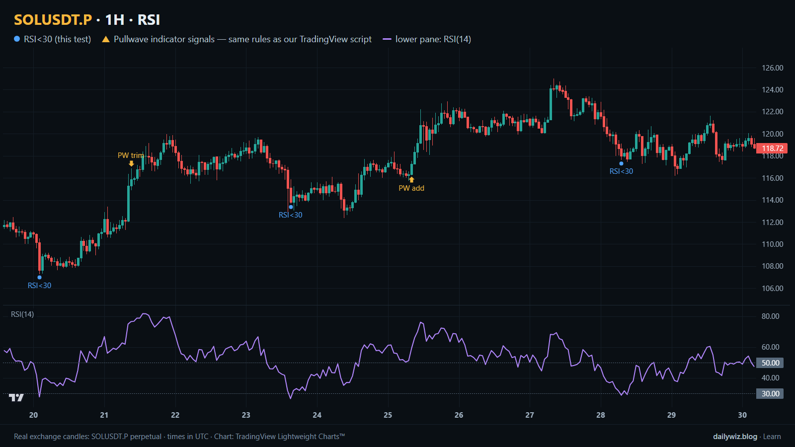
On the chart above, the blue dots mark each bar where RSI(14) crossed below 30, and the lower pane shows the RSI(14) line so you can see how the reading arrived. Notice how differently the dots sit: some inside a shallow pullback, others inside a sharper slide.
If you use this condition, the test suggests treating it as context rather than a trigger. Worth checking first: whether the higher-timeframe trend is up or down, since the yearly table shows the same rule inverting between recovery years and 2022; how fast RSI fell into the zone, because one violent bar and a slow grind are different situations; and whether the market is in a news-driven repricing, where the November 2022 cases show the threshold offering no protection.
What would invalidate the idea in practice is RSI staying below 30 bar after bar while price keeps making lower lows. That is a trend, not an extreme. It is also why position size and a predefined invalidation level matter more here than the signal itself: with a median worst dip of -3.31% and 34.1% of events dipping more than 5%, a stop placed close to the signal bar would be hit often even on events that eventually resolved higher.
How the Pullwave indicator approaches this
Pullwave is an invite-only TradingView indicator and it is rule-based: fixed rules on price and volume, with no discretion. Its rules are not published, it does not predict the future, and it has losing trades. On the chart above, the gold arrows are Pullwave's marks on the same candles, taken from its public record, which follows the same rules as the TradingView script; you can compare where those arrows print against the blue dots of the technique we tested.
The comparison worth making is structural, not numerical. The technique here is a single condition: one line crosses one level, and everything after that is left to the reader. Pullwave marks long and short entries, add-ons, partial exits and exits, and it can send a TradingView alert when a mark prints. The futures version is built around SOLUSDT perpetual futures; the spot version runs on candles of major coins. The user places any orders themselves; the indicator only draws marks and sends alerts. The general idea a reader can take from today's results is that a single-condition trigger is noisy on its own, and a complete rule set also has to answer when to add, when to take partial profit and when to exit.
Key takeaways
- Across 367 hourly events on SOLUSDT since Jun 2021, RSI(14) crossing below 30 was followed by a higher close 50.7% of the time after one day, against a 49.6% baseline. The tilt is there, and it is very small.
- The shortest horizon was the friendliest: 53.1% higher after 4 hours with a median of +0.10%, versus 49.8% at baseline.
- Medians were positive while means were negative at every horizon, meaning a few large failures carried the distribution.
- The rule was not stable over time: 61.3% higher in 2023 against 42.0% in 2022 suggests the regime mattered more than the reading.
- If you use this condition, consider it as one input alongside trend and risk rules, and remember that 34.1% of events dipped more than 5% within the first day.
The gold arrows on the chart are marks from the Pullwave indicator for TradingView. See how the Pullwave indicator works on pullwave.net.
Chart rendered with TradingView Lightweight Charts™ from real exchange candles. tradingview.com