ETH 4H Bollinger Band Squeeze: Does a Bigger Move Really Follow?
We tested 104 Bollinger Band squeezes on ETH/USDT 4H candles. The median three-day range after a squeeze was 6.9% against 7.4% for any bar, and 50.0% of breakouts went up.
- Market
- ETH/USDT spot
- Timeframe
- 4H
- Data
- Nov 2022 – Oct 2026
- Sample
- 104 samples
Almost every book on Bollinger Bands repeats the same line: volatility is cyclical, so a period of compression tends to be followed by a period of expansion. The practical version of that idea is the squeeze. The bands pinch together, traders lean forward, and somebody in the chat says the market is "coiling for a big move."
It is a tidy story, and it is testable. If a squeeze on ETH really precedes bigger moves, then the ranges that follow squeezes should be measurably wider than the ranges that follow an ordinary bar. And if a squeeze also tells you something about direction, the breakouts should lean one way more often than a coin flip. We ran both checks on four-hour ETH/USDT candles, and the answers were not what the story promises.
What Bollinger Band squeeze measures
Bollinger Bands are three lines. The middle line, the basis, is a simple moving average of closing prices, traditionally over 20 bars. The outer lines sit a fixed number of standard deviations of price above and below that average, traditionally 2. Standard deviation is a measure of how far recent closes have scattered around their own average, so when price has been drifting quietly, the scatter is small and the bands pull in close to the basis. When price starts swinging, the scatter grows and the bands flare out.
Band width turns that visual into a number. You take the upper band minus the lower band and divide by the basis, which expresses the distance between the bands as a percentage of price. That division matters, because a fixed dollar gap means something very different at different price levels.
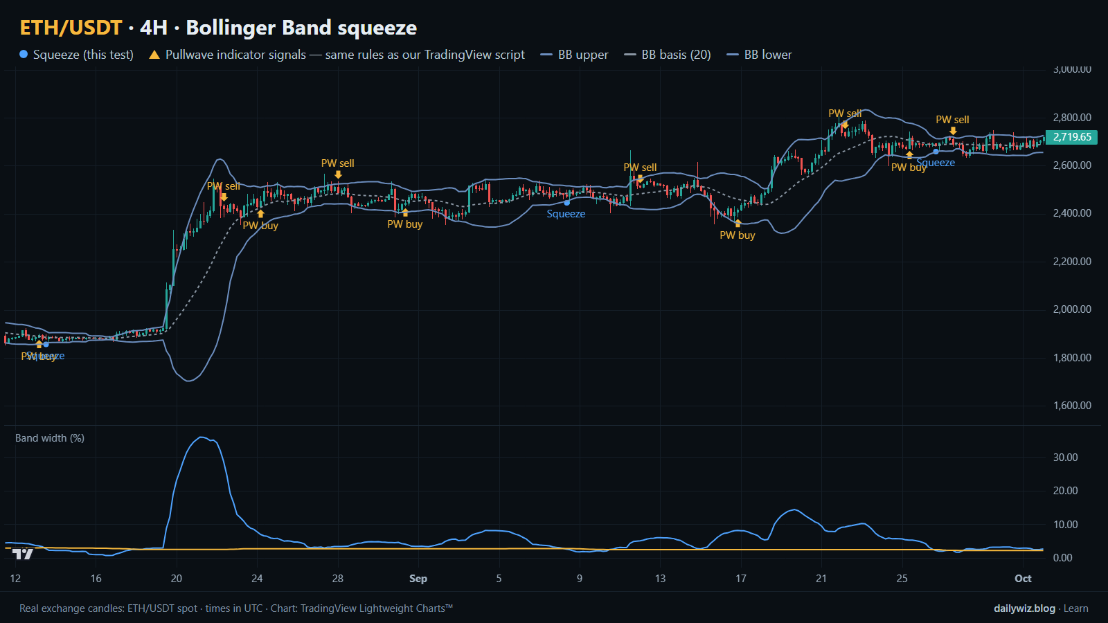
A squeeze is simply a low reading on that band width series. There is no universal threshold, so most traders define it relative to recent history: band width is "tight" when it sits near the lowest values of the past few hundred bars. The usual reading is that tightness is a warning about conditions, not a signal in itself. The chart above shows this directly, with the three band lines on price and band width plotted in the lower pane, so you can see the pinch and the flare in the same place.
The test
We used Binance ETH/USDT spot candles on the 4H timeframe, from Nov 2022 to Oct 2026, which is 8587 bars. All timestamps are UTC.
The rule: Bollinger Bands with a 20-bar SMA basis and bands at 2 standard deviations. A squeeze starts when band width, measured as upper minus lower divided by the basis, falls into the lowest 10% of the previous 500 bars. We only counted the bar where a squeeze starts, so a long quiet stretch in which many consecutive bars qualified produced one event rather than dozens. That acts as the cooldown here. It left 104 events.
For each event we took the close of the signal bar as the reference point and measured two things over the following 1 day, 3 days and 7 days: the high-to-low range of the whole window, and the absolute close-to-close move, meaning how far price ended up from where it started regardless of sign. Range captures how much the market moved around; absolute move captures how much it actually went somewhere.
The baseline is "any bar": the same two measurements taken from every bar in the sample, not just the squeeze bars. That is the comparison that matters, because ETH moves plenty on an average four-hour candle. A squeeze is only informative if it beats the ordinary case. Our main horizon is 3 days. These figures were calculated on historical prices; they are not actual trades. No fees or slippage are included, and we used the median throughout rather than the average, because a handful of violent weeks would otherwise dominate.
Results
High-to-low range after a squeeze vs any bar
| Window after | Squeezes | Median range: after squeeze | Median range: any bar | Median |close move|: after squeeze | Median |close move|: any bar |
|---|---|---|---|---|---|
| 1 day | 104 | 3.8% | 4.1% | 1.8% | 1.5% |
| 3 days | 104 | 6.9% | 7.4% | 2.7% | 3.0% |
| 7 days | 103 | 11.6% | 11.7% | 4.4% | 4.6% |
Calculated on historical prices; not actual trades. Fees and slippage not included.
The first column pair is the headline test, and it does not support the story. At 1 day, the median high-to-low range after a squeeze was 3.8% against 4.1% for any bar. At 3 days it was 6.9% against 7.4%. At 7 days, 11.6% against 11.7%, where one event was dropped because the sample ended before its window completed, leaving 103. In other words, the days after a tight squeeze were, in the middle of the distribution, slightly quieter than days picked at random, not louder.
The absolute close-to-close move tells a marginally more interesting story at the shortest horizon. Over 1 day, the median absolute move after a squeeze was 1.8% versus 1.5% for any bar. So the day after a squeeze tended to travel a little further from its starting point even though its total range was no wider, which is what you would expect if quiet conditions produce fewer back-and-forth whipsaws and more one-way drift. That small advantage disappears at longer horizons: 2.7% against 3.0% at 3 days, and 4.4% against 4.6% at 7 days.
On direction, the result is as clean as it gets. Of the 104 events, 50.0% resolved upward over the 3-day window. There is nothing in the squeeze itself that points up or down.
Where it failed
The worst outcomes were not failures of the squeeze to produce volatility. They were cases where it produced plenty of volatility in the direction that would have hurt anyone who assumed an upside breakout.
The deepest was 2025-04-06 00:00 UTC, with ETH near 1,810. Over the next three days the close-to-close move was -21.6%, with the worst dip at -23.5%, which means there was essentially no comfortable period at all before the damage. On 2025-01-06 16:00 UTC, from about 3,687, the move was -13.3% with a worst dip of -13.5%. On 2026-01-17 20:00 UTC, from about 3,311, the move was -11.2% with a worst dip of -11.8%.
Compare those with the best cases. On 2024-05-20 08:00 UTC, from about 3,094, the three-day move was +26.7% with a worst dip of only -0.6%. On 2024-02-12 08:00 UTC, from about 2,488, the move was +12.3% with a worst dip of -0.3%. Both the biggest gains and the biggest losses came out of the same setup, and in each case the move ran almost immediately in one direction without hesitating. The squeeze marked the coil; it said nothing about which way it would spring.
The recent events look different again, and they are the more typical outcome. On 2026-08-08 12:00 UTC the three-day move was -3.1%, on 2026-08-13 12:00 UTC it was +0.2%, on 2026-09-08 08:00 UTC it was -0.7%, and on 2026-09-26 16:00 UTC it was +0.2%. Three of those four effectively went nowhere. That is the fat middle of the distribution the medians in the table are describing.
How to read it on your chart
The honest use of a squeeze is as context, not as a trigger. On the chart above, the blue dots mark where our rule fired: three of them inside this window of 310 bars. Look at the band width pane underneath each one and you will see that the condition is relative, so a reading that counts as tight during a calm stretch would not count as tight after a violent month.
If you use this, consider three checks before leaning on it. First, direction has to come from somewhere else, because the test found 50.0% upside resolution, so trend structure, higher-timeframe levels or volume are doing the real work. Second, the squeeze stops describing current conditions the moment band width expands, and that expansion can begin against your position just as easily as with it. Third, size for the cases in the section above, not for the medians: a setup that can deliver -23.5% in three days with no quiet period first needs an invalidation level defined before the move starts, not after.
How the Pullwave indicator approaches this
Pullwave is an invite-only TradingView indicator. It is rule-based: fixed rules on price and volume, with no discretion, and those rules are not published. On the chart above, the gold arrows are Pullwave's marks on the same candles that carry the blue dots of our squeeze rule, taken from the public record on pullwave.net, which uses the same rules as the TradingView script. Comparing the two sets of marks is the useful exercise here, because they are answering different questions about the same price history.
Pullwave marks long and short entries, add-ons, partial exits and exits, and it can send a TradingView alert when a mark prints. The futures version is built around SOLUSDT perpetual futures; the spot version runs on major coins. It does not predict the future and it has losing trades, and the user places any orders themselves, since the indicator only draws marks and sends alerts.
The structural idea a reader can take from today's test is this: a single-condition trigger like the squeeze is noisy on its own, while a complete rule set also has to answer when to add, when to take partial profit and when to exit.
Key takeaways
- On ETH/USDT 4H from Nov 2022 to Oct 2026, the median high-to-low range after a squeeze was 6.9% over three days against 7.4% for any bar, so the test suggests no volatility expansion edge at that horizon.
- The only place the squeeze led the baseline was the 1-day absolute close-to-close move, 1.8% against 1.5%, a small gap that faded at 3 days and 7 days.
- Direction was a coin flip: 50.0% of the 104 events resolved upward over three days.
- The extremes ran both ways, from +26.7% to -21.6% in three days, so if you use this, consider defining invalidation and size before band width expands.
- Treat a squeeze as context about current conditions rather than as a standalone trigger, and let trend and risk rules decide what you do with it.
The gold arrows on the chart are marks from the Pullwave indicator for TradingView. See how the Pullwave indicator works on pullwave.net.
Chart rendered with TradingView Lightweight Charts™ from real exchange candles. tradingview.com