BTC 4H MACD crossovers: do crosses below zero work better?
We counted 230 bullish MACD crossovers on BTC/USDT 4H since Nov 2022. Three days later 52.4% closed higher against a 52.8% baseline, and crosses below zero looked mildly better than crosses above it.
- Market
- BTC/USDT spot
- Timeframe
- 4H
- Data
- Nov 2022 – Oct 2026
- Sample
- 230 events
Almost every charting platform ships with MACD switched on by default, and the crossover is the first thing most traders learn from it: the fast line crosses above the slow one, and that is read as a shift toward buyers. The more experienced version of the same idea adds a filter. A cross that happens deep below the zero line is called a turn out of weakness; a cross above zero is called continuation inside an existing uptrend. Many traders are told to take only the second kind.
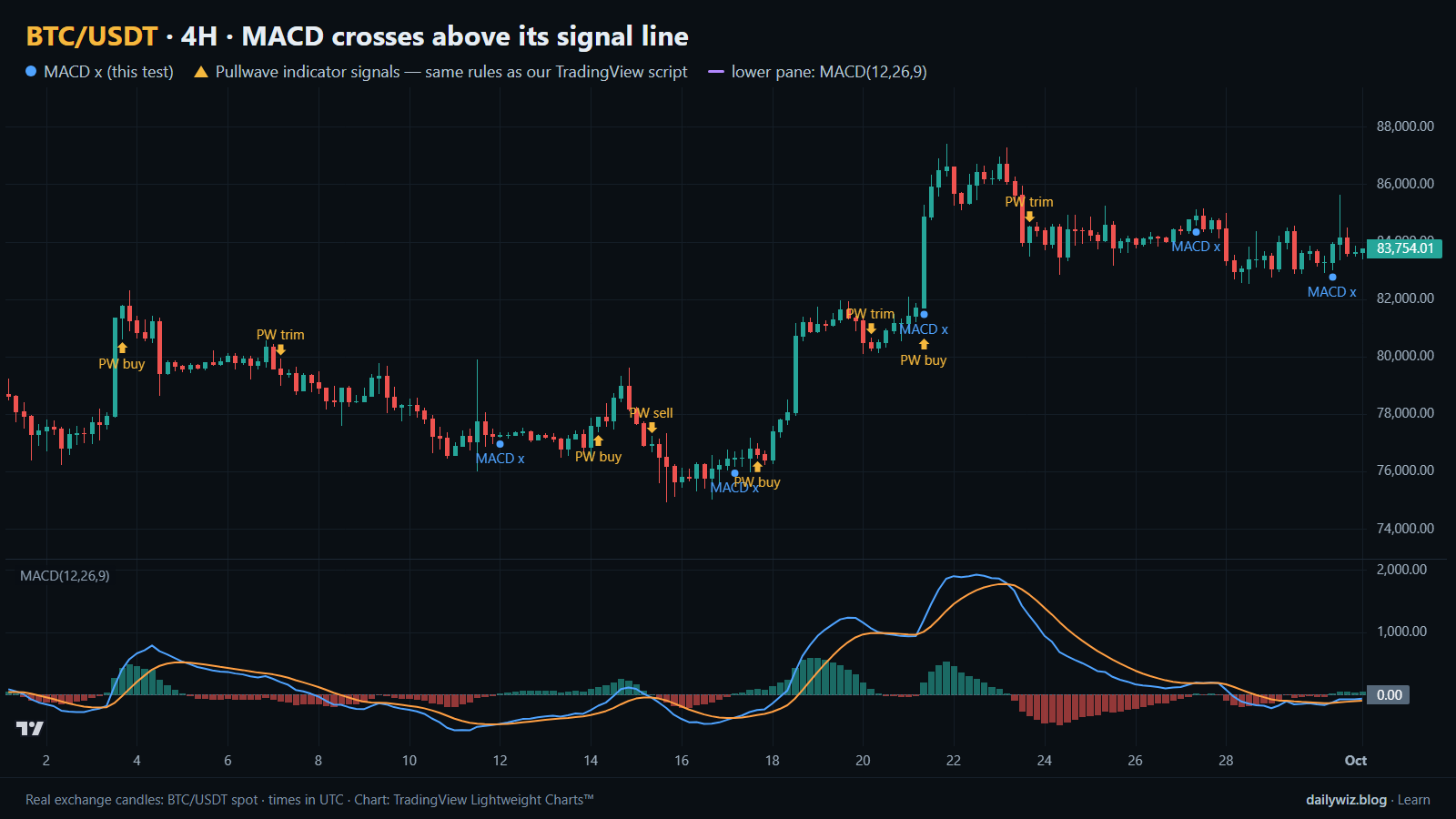
So we counted. On BTC/USDT 4H candles, how often does price actually sit higher one, three and seven days after a bullish MACD crossover, how does that compare with picking a bar at random, and does the position of the MACD line relative to zero change the answer? The chart above shows the most recent month, with blue dots marking the crossovers we tested and the MACD(12,26,9) pane underneath.
What MACD measures
MACD is a difference between two moving averages. You take an exponential moving average of the close over 12 periods and subtract an exponential moving average over 26 periods. The result is the MACD line. When the fast average sits above the slow one the line is positive; when it sits below, the line is negative. Zero is simply the point where the two averages meet.
A second line, the signal line, is an exponential moving average of the MACD line itself over 9 periods. Because it smooths an already smoothed series, it reacts later. The histogram in the same pane is just the gap between the two lines. The standard settings are 12, 26 and 9, and those are what we used.
The usual reading has two layers. The crossover layer: MACD crossing above its signal line is read as momentum turning up. The position layer: the MACD line above zero is read as an uptrend, below zero as a downtrend. Both layers are built from averages of past closes, which makes MACD descriptive rather than predictive. It reports what momentum has already done.
The test
We used Binance BTC/USDT spot candles on the 4H timeframe, from Nov 2022 to Oct 2026, which is 8581 bars. All timestamps are UTC.
The rule: the MACD line (EMA 12 minus EMA 26 of the close) crosses above its signal line (EMA 9 of the MACD line) on a closed 4H bar. Only closed bars counted, so nothing here depends on a cross that could still disappear. Each event was tagged by whether the MACD line was below or above zero at the cross. After an event, new events were ignored for 18 bars, so one choppy stretch cannot flood the sample with near-duplicates. That left 230 events.
Outcomes were measured from the close of the signal bar to the close 1 day, 3 days and 7 days later, with 3 days as the main horizon. Per-horizon counts are slightly smaller because the newest signals do not yet have a full forward window. The baseline is the same forward move measured from every bar in the period, not only signal bars — the honest comparison, because a technique that merely matches it is describing BTC rather than adding information. These figures were calculated on historical prices; they are not actual trades. No fees and no slippage are included, and both would subtract from anything shown below.
Results
What happened after the signal (MACD crosses above its signal line)
| After | Events | Closed higher | Median move | Middle half (25th / 75th pct) | Worst | Baseline: closed higher | Baseline: median |
|---|---|---|---|---|---|---|---|
| 1 day | 229 | 45.0% | -0.10% | -1.3% / +1.0% | -5.5% | 52.1% | +0.07% |
| 3 days | 229 | 52.4% | +0.13% | -2.0% / +2.5% | -14.4% | 52.8% | +0.19% |
| 7 days | 228 | 49.6% | -0.09% | -3.0% / +4.1% | -22.3% | 53.7% | +0.40% |
Calculated on historical prices; not actual trades. Fees and slippage not included.
The one-day column is the clearest result, and it is not flattering. Only 45.0% of signals closed higher a day later, with a median of -0.10%, while the baseline closed higher 52.1% of the time with a median of +0.07%. The bar after a fresh crossover was, on average, a slightly worse place to be than an arbitrary bar — consistent with lines that cross only after part of the push has already happened.
At three days the signal catches up without passing the baseline: 52.4% higher against 52.8%, median +0.13% against +0.19%. At seven days it falls behind again, 49.6% against 53.7%. The spread widens with time — the middle half of three-day outcomes ran from -2.0% to +2.5%, with extremes of +23.9% and -14.4% — but the center never moves meaningfully above the baseline.
Path matters as much as the final close. Inside the three-day window the median worst dip was -2.47% and the median best rise was +2.27%, and 15.2% of events dipped more than 5% at some point. Drawdown first was the normal experience, including for signals that ended positive.
By year (move after 3 days)
| Year | Events | Closed higher | Median move |
|---|---|---|---|
| 2022 | 7 | 57.1% | +0.06% |
| 2023 | 58 | 51.7% | +0.10% |
| 2024 | 58 | 55.2% | +0.82% |
| 2025 | 62 | 41.9% | -0.52% |
| 2026 | 44 | 63.6% | +0.43% |
Calculated on historical prices; not actual trades. Fees and slippage not included.
By year the picture is unstable rather than trending. 2024 and 2026 show the friendliest medians, 2025 is the weakest at 41.9% higher with a median of -0.52%, and 2022 has only 7 events, too few to read. Results that flip like this suggest a tool that inherits the market's regime instead of standing apart from it.
Split: MACD line below vs above zero (move after 3 days)
| Group | Events | Closed higher | Median move | Worst |
|---|---|---|---|---|
| MACD line below zero | 136 | 54.4% | +0.25% | -14.4% |
| MACD line above zero | 93 | 49.5% | -0.02% | -8.9% |
Calculated on historical prices; not actual trades. Fees and slippage not included.
Now the question in the title. Crosses with the MACD line below zero closed higher 54.4% of the time with a median of +0.25%, slightly ahead of the baseline. Crosses above zero closed higher 49.5% of the time with a median of -0.02%, slightly behind it. The below-zero group looked a little better here, which is the reverse of the common advice to take crossovers only in an established uptrend. The gap is small, the sub-samples are modest at 136 and 93 events, and the below-zero group also carried the worse single outcome, -14.4% against -8.9%. The test suggests a mild tilt, not a filter to lean on.
Where it failed
The worst three-day outcome followed the cross on 2026-02-02 12:00 UTC at 78,850: -14.4%, with a -15.4% dip along the way. Price did not stall and recover; it continued down from the signal bar.
Second worst was 2024-04-11 04:00 UTC at 70,736, -8.9% at three days with a -14.2% dip. Third was 2024-07-29 00:00 UTC at 69,348, -7.8% with a -8.1% dip, so that whole move was adverse too.
All three share a shape: the crossover printed on a bounce inside a larger decline, momentum turned up on the indicator while price was still rolling over, and the next impulse was down. The best cases mirror it — 2023-03-11 16:00 UTC returned +23.9% with a 0.0% dip, and 2023-10-23 00:00 UTC returned +13.2% with a -1.2% dip, both at the start of sustained advances. The crossover itself did not tell the two situations apart.
How to read it on your chart
If you use crossovers, check first that the bar is closed. On a live 4H bar the lines can cross and uncross before the candle ends, and much of the frustration with MACD comes from acting on that.
Second, label where the cross sits relative to zero, as we did. Our split suggests the below-zero case was not the weaker half here, so discarding those crosses by habit may remove the slightly better group.
Third, treat the dip numbers as the practical constraint. With a median worst dip of -2.47% and 15.2% of events dipping more than 5%, a position sized as if the signal were immediately right will be uncomfortable often. What invalidates the idea quickly is a close back below the signal line, or a cross forming while price keeps making lower highs — the shape the February 2026 and April 2024 failures shared. On the chart above, look at each blue dot and ask whether you could have separated it from the others before the following bars arrived.
How the Pullwave indicator approaches this
The gold arrows on the chart above are Pullwave's marks on the same candles, taken from the public record on pullwave.net, which follows the same rules as the TradingView script. Comparing them with the blue dots of the tested crossover is the useful exercise: where the two agree, where only one of them prints, and how each behaves in the stretch you are looking at.
Pullwave is an invite-only TradingView indicator. It is rule-based, with fixed rules on price and volume and no discretion, and those rules are not published. On the chart it marks long and short entries, add-ons, partial exits and exits, and it can send a TradingView alert when a mark prints. The futures version is built around SOLUSDT perpetual futures; there is also a spot version for major coins. It does not predict the future and it has losing trades, and the user places any orders themselves — the indicator only draws marks and sends alerts.
The general idea a reader can take from today's test is that a single-condition trigger, like the crossover we counted, is noisy on its own. A complete rule set also has to answer when to add, when to take partial profit and when to exit.
Key takeaways
- Across 230 bullish MACD crossovers on BTC/USDT 4H since Nov 2022, the three-day result (52.4% higher, median +0.13%) essentially matched the baseline of 52.8% and +0.19%, so the cross added little by itself.
- The one-day window was the weakest, at 45.0% higher with a median of -0.10% against a 52.1% baseline, which fits an indicator that reacts after the move.
- Crosses below zero (54.4% higher, median +0.25%) looked mildly better than crosses above zero (49.5%, -0.02%), the reverse of the usual advice, but the gap is small.
- If you use this, consider the path as well as the outcome: the median worst dip inside three days was -2.47%, and 15.2% of events dipped more than 5%.
- Yearly results swung from 41.9% higher in 2025 to 63.6% in 2026, so treat any single year as regime-dependent rather than as proof.
The gold arrows on the chart are marks from the Pullwave indicator for TradingView. See how the Pullwave indicator works on pullwave.net.
Chart rendered with TradingView Lightweight Charts™ from real exchange candles. tradingview.com